Star Citizen ’s latest Around The Verse installment has just arrived, bringing with it some small updates on the 3.0 Evocati as well as an in-depth look at Cloud Imperium Games’ cockpit creation process. There’s a lot to unpack, so let’s get to it.
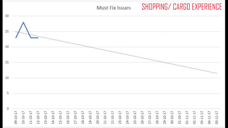
Starting with 3.0, the team has now reset the alpha’s development clock to focus on polishing systems pertaining to shopping. The team currently has 23 must-fix issues to resolve before that part of the demo is suitable for public consumption. This week, QA worked on ironing out kinks tied to general performance: clothing not showing up correctly, the inability to interact with objects behind glass and some bizarre shopper animations. With the new Delta Patcher in place, however, these fixes are being pushed to the Evocati group faster than ever.

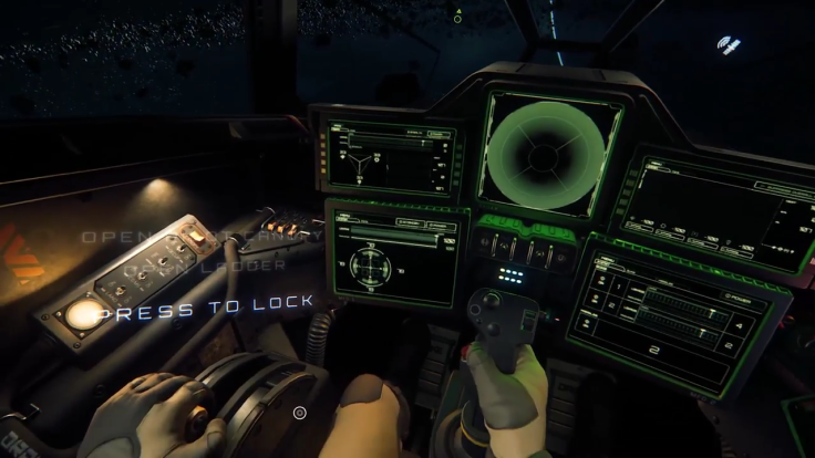
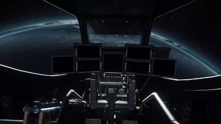
The main feature this week was the cockpit creative process, and CIG did a stellar job of showcasing it as a collaborative effort between designers, animators and programmers to create the best possible in-ship experience. The sprint began with a reconsidering of the Gladius. After 60 individual changes were made to its standard design, the principles learned there were applied to several other crafts. For 3.0 specifically, the emphasis has been on the Gladius, Buccaneer, Herald, Cutlass, Sabre and Vanguard. You can take a look at the Cutlass redesign above.
Like most things Star Citizen, there’s a lot more under the hood beyond the beautiful aesthetic. To create the flight sensibilities players will want, the teams had to ensure cockpits react realistically to damage, g-force and the previously highlighted Actor Status System . That means, for example, the amount of force a ship experiences must also translate to the player. As a result, greater force creates more disorientation on screen. With six different damage axes to work from, destruction can take dozens of forms as crafts deteriorate. The effects come from the ship itself and take aspects like heft and distance of impact into account. All breakdown signals are manually added, but chosen from a large database of options.
When not under attack, cockpits must also be accessible spaces. One of the biggest usability changes from past builds is that all screen displays on ships have been moved forward slightly, so they’re easier to read. While in Interaction Mode, the player is also able to see exactly what each button does on the given panel. These buttons are laid out in fairly similar arrangements for the sake of familiarity, and additional sounds and signals will alert pilots to how the machinery is functioning. Skill will take over once you’ve sat in the seat, but basic instruction will be offered to everyone.

On the programming side, the major pressure point was manipulating the slave system so that characters maintained a sense of bodily control while piloting vehicles. After much deliberation, the team designed a framework where seats still mandate piloting functions but the top half of the player is freed up for basic tasks, animations and poses while driving. Because there are so many small pieces in play to make that work, some called the feature the biggest challenge of the latest cockpit sprint.
Keeping these complex concepts in mind, Gameplay Programmer Romulo Espinosa described the immense importance of the cockpit experience to the larger Star Citizen vision:
“Everyone in the company was trying to get these things right because this goal has been there forever, but if we break this code nothing is going to work in the game. Absolutely nothing. Mechanics are not going to work, the character is not going to work, the editor is not going to work, of course the game is not going to work.”
In that sense, three tiers of team collaboration were essential for the polished cockpits seen in the latest alpha.
Star Citizen is in alpha for backers on PC.
What are your thoughts on Star Citizen’s new cockpit designs? What’s the first thing you’ll do when piloting your ship in 3.0? Tell us in the comments section!


