It’s been nearly seven years since Little Alchemy developer Jakub Koziol dropped his first version of the hit game on the Google Chrome store. Over time, Koziol has faithfully maintained the mobile title, updating and growing the original library of 90 items over 500. But now Lozoil has decided to grow Little Alchemy in a way no one anticipated as Wednesday he quietly released its sequel, Little Alchemy 2, to the Apple App and Google Play store.
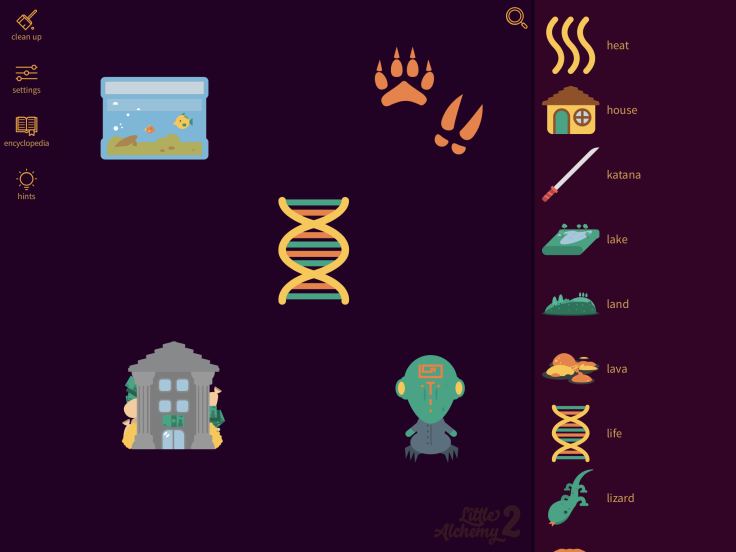
Some might be tempted to call Little Alchemy 2 a remastered version of the original, but actually it’s a bit deeper than that. For fans of the original Little Alchemy, the gameplay will be familiar but pretty much everything else has changed. The most obvious change is a drastic graphic redesign, which Koziol told Player.One was long overdue.
“Little Alchemy’s art style hasn’t changed substantially since the first release in 2010,” said Koziol. “Before I even started working on the sequel, I knew the visual layer would need some serious improvement.”
And improved it has. While the original Little Alchemy featured a clean and simple cream-colored workspace with a muted icon color scheme, Little Alchemy 2 goes dark. The workspace and items panel are stained deep shades of argyle purple and plum, while the icons employ a varied palette of warm and complementary colors. Each icon in the game has also been completely reworked, using a bouncy and cartoon-like style that adds a tremendous amount of aesthetic appeal and would great Messages sticker art.

The icons for the original Little Alchemy game were designed entirely by Koziol himself, but for the sequel the dev collaborated with graphic artist Simon Post to create an entirely new look.
“I needed something simple and scalable and drawing everything on my own just wouldn't cut it anymore. Incorporating Simon Post’s recognizable style of vector art has certainly elevated the game to the next level,” Koziol told Player.One.
Graphic design isn’t the only place Koziol reached out to others for inspiration. He also enlisted Ubisoft’s Jason VandenBerghe to help create and categorize an extensive new library of nearly 700 craftable items for Little Alchemy 2. While some of the items are crossovers from the original version, many are new or require new recipes to be crafted.
Koziol admits that designing the original Little Alchemy was daunting at times due to the gameplay constraints and thought processes the game employs. But with the base already laid, it was much easier to create the large library of items found in the new version.
“Creating new items for the library can be hard," said Koziol. "You can only mix two items at the time, so there's a lot of simplification and mental leaps you have to make. You also have to look at things different ways, and include different types of logic that lead to the same outcome ... Then at some point you have to look at the whole thing and ask yourself if what you just did makes sense. With Little Alchemy 2 it was a bit easier because we already had a huge library we could lean on. It was just a question of 'what do I need to get to this item?’”
Another impressive addition to Little Alchemy 2 is a detailed encyclopedia, chock full of stats and information for players to geek out on. The encyclopedia is broken into a home and items tab. On the home tab you’ll find the items you’ve discovered so far, how many final items you’ve crafted and a list of recent discoveries. But the items tab is where the real wealth of information is found. It offers tags to look up items you’ve found by category, or you can search for a specific items by name. Tapping on an item in the encyclopedia will lead you to its dedicated page, which is delightfully detailed. The top of the page includes a picture and a witty description. Scroll down and you’ll find every combination you’ve used so far to make the item, along with the number of combinations you haven’t found yet. The page also includes recipes you’ve discovered that use that particular item and the number of items you have yet to discover which utilize it.
The encyclopedia adds a level of quality to the game that Koziol attributes to VandenBerghe. “Jason did a lot of work classifying items so players could better understand how they interact with each other,” said Koziol.
Despite the substantial redesign of Little Alchemy 2 , Koziol’s stance on monetization hasn’t changed. Just as in the earlier version, Little Alchemy 2 is completely free of charge and doesn’t employ obtrusive ads. Players have the option to purchase a premium currency called “research points,” which unlock personalized hints and cheats, an intentional design decision made by Koziol.
“From the beginning, I’ve wanted to keep the game free to make sure that everyone can play it. It’s also been super important to me to make sure the hints are not detrimental to gameplay. Maybe it's not the best idea for the business but I want to respect Little Alchemy' s players by making in-app payments very optional.”
Little Alchemy 2 has thus far fallen under the radar of the Apple App and Google Play stores, but we’re sure it won’t be long before many discover this revamped gem. You can download Little Alchemy 2 now for free on both the Apple App and Google Play store or you can play the browser version at https://littlealchemy2.com.


