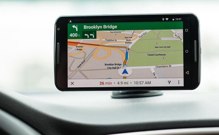
Former Head of Cartography for Apple Justin O'Beirne is in the middle of writing a four-part essay detailing the differences of Google Maps vs. Apple Maps. Each is the respective “Internet Explorer” map app of its operating systems, giving Google Maps a huge lead in usage, but Apple Maps has come a long way from the snafu-filled reputation it earned while taking its baby steps.
The main design difference O'Beirne focused on in part one of his essay was the way Google Maps vs. Apple Maps labeled cities, roads and places. He found that Apple Maps labels cities more, while Google Maps focused on labeling roads more.
Secondly, while both map apps have a similar number of points of interest, they shows drastically different places, with only a 15 percent overlap. The categories that O'Beirne used to calculate this are: Things To Do & See, Eat & Drink, Shopping & Services, Airports, Transit Stations, Universities, Hospitals and Other.
Google Maps prioritizes transit-related points of interest, according to O'Beirne, before showing Eat & Drink places at the more zoomed-in views. Apple Maps returns Things to Do & See places (i.e. landmarks) before focusing on the Shopping & Services and Eat & Drink categories.
In summary, Google Maps presents an utilitarian view of the world, while Apple Maps is for the sightseer and “staycationer.” If you’re wondering why this is, O'Beirne has been nice enough to write an entirely different essay on the subject, as well as another essay on the battle between the two map apps becoming what he calls, “The Universal Map.”
Stayed tuned to O'Beirne’s Twitter to know when part two of his comparison essay is released. O'Beirne is also the author of the maps-focused blog 41Latitude.
New Essay: "Cartography Comparison: Google Maps & Apple Maps"https://t.co/qfhgqqonk9
— Justin O'Beirne (@justinobeirne) June 2, 2016


