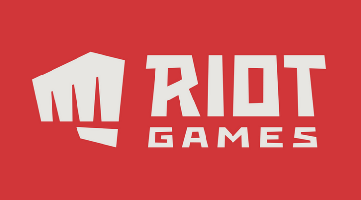
Riot Games, the developer of League of Legends, officially released its new logo. Players have been left wondering early this week when Riot's official Twitter accounts changed profile pictures.
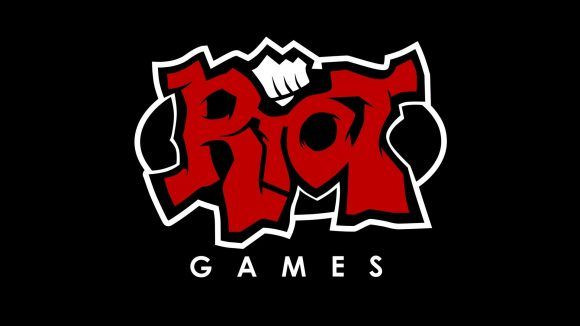
In a statement published on its website, Riot said that when it was founded in 2006, there was a need to come up with a logo that would go with the name. Founders Brandon Beck and Marc Merrill wanted the logo to be unique as well as recognizable. They wanted something with a punch, and thus the first was born.

Riot said that this was a time when "iPhones were still a year away from being released" and that "Facebook membership was still limited to college students." Thus when the logo was first sketched, there was no consideration for scaling, much less for readability when it came to app use. As technology started to change, the company said that it started to play around in the new environments. Eventually it became clear that the old logo would need a rework.
In coming up with the new logo, one big change was that the fist was now separate from the word Riot. The company argued that this was nothing new and that the main goal was to make sure that the fist was easily recognizable even without the word. Another change was making the fist right-handed in order for it to mirror the letter "R."
Reactions to the change are mixed and leaning towards the negative. In a Reddit thread, user SoldierOS said that the "logo looks like one of those indie game developer logos" while adding that it was "uninspiring and bland, without 'personality'." User deathspate meanwhile said that "it reminds me of one of those forgettable movie studio logos you see at the beginning of movies, the kind that doesn't even have sound with it."
The change, however, is not surprising for those familiar with design. In particular, the move to use flat logos started way back in 2013 with the release of the iOS 7 update. For those in the design industry, it marked the time when the world became flat.


