Star Citizen ’s latest Around The Verse not only debuted a new segment called Burndown, but it also touched on the game’s integral MobiGlass UI. Want to hear about the latest features and the current progress on alpha 3.0? You’ve come to the right place.
Starting first with Burndown, the special report offered a brief look at how 3.0 continues to shape up for its scheduled release next month. As it stands right now, the alpha has around 90 major issues, with about a dozen of those being addressed over the past week.
In addition to garden variety crashes and freezes, testers are also looking into issues with planet rotation, characters falling through environments and boxy rover wheels. In total, the team still has 10 pages of checklists to wade through before 3.0 is ready for backers.
Despite the obvious disappointment news like this might bring, Director Eric Kieron Davis gave fans some words of hope:
“You’ll see this number [of bugs] dwindle week by week until we’re ready to release, and with quality as our top priority we’re going to keep pushing hard to this release out as quickly as possible.”
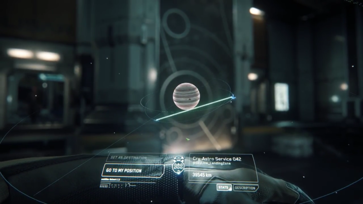
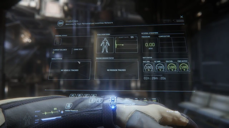
Beyond 3.0, an integral feature to Star Citizen is its distinct MobiGlass UI. In simple terms, it’s the living, breathing, smartphone-like interface all players will encounter. It’s intrinsically linked to the render to texture technology of holograms, but it’s planned to expand upon those established foundations in unique ways.
Like many aspects of the Star Citizen universe, MobiGlass will uniquely adapt to the environment in which it’s used and accessed. It’s generally activated via the character’s arm, and all clothing in the game has been specifically designed to support it. This diversity is planned to grow beyond the boundaries of accessories too. Different cultures within the universe will support different kinds of MobiGlass. Wealthier areas may have modern versions of it for sale, while modest communities might prefer a more basic setup.
In action, MobiGlass is very analogous to smartphones in the real world. Players can buy cheap or expensive versions of it, and the more premium offerings might be seen as status symbols. Regardless of aesthetic, however, all versions have widgets and apps that display critical information as it arrives. For example, a weather widget may inform the player that the environment around them is too hazardous to inhabit. For apps, programs exist to manage quests and inventory.
MobiGlass is a conduit for the Starmap too. The entire universe of Star Citizen must be compressed and displayed on the tiny UI screen in real time. Bringing that vision to fruition has ultimately been a tough task for designers, but it will be ready to go when the game’s complete.

A keen effort has also been made to ensure using MobiGlass is a pleasant experience. Its menus are designed to be a simple, soothing break from the action, and that goal even translates to sound design. The audio team has used coiled pick up microphones to capture a tempered technological soundscape that can be heard in the clip above.
These details might sound like standard fare when it comes to sci-fi game menus, but the true uniqueness of MobiGlass comes from the fact that characters are actually aware of it within the physical space. Having a projected menu system allows elements to be easily navigated in virtual reality if and when those features are implemented.
Star Citizen is available now in alpha for PC Backers. Alpha 3.0 is expected to hit public test servers next month.
What do you think about MobiGlass and this latest 3.0 progress report? Will the team hit its September target? Tell us in the comments section!


